Branding and Art Direction
for the Ateneo Freshman Orientation, June 6-7, 2013
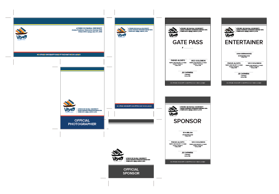
As the Design Head, it was my job to create the branding for the 2-day event and to manage a team of five designers. Together, we created all of the design needs of the Ateneo freshman orientation which happened on June 6-7, 2013.
The OrSem 2013 Design Team was composed of Czari Dycaico (3 BFA ID), Krizia Lim (3 BFA ID), Chelli Reyes (2 BFA ID), Gica Tam (3 BFA ID), and Meg Quintos (3 BFA ID).
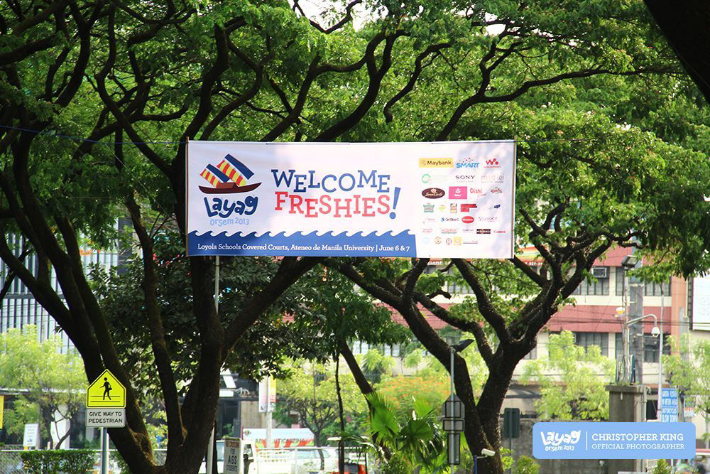
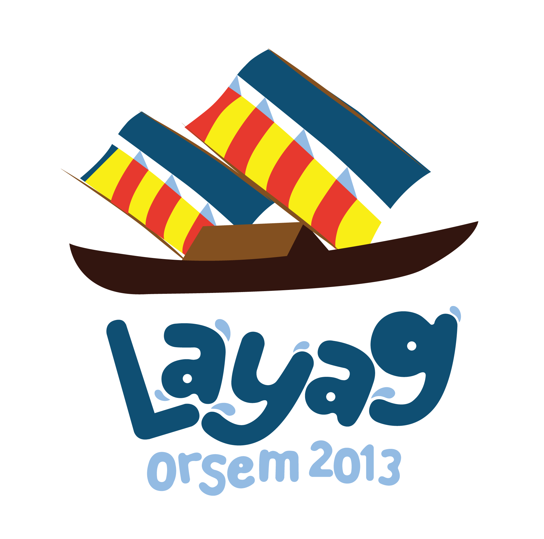
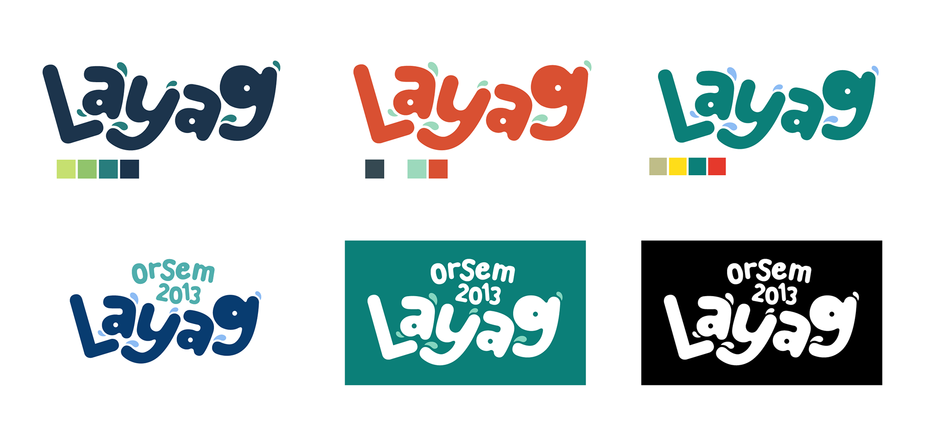
Final Logo
The challenge for the logo was to make something that had less colors. Directions from the OrCom said that I had to use a balangay to give emphasis to the theme's Filipino reference. However, balangays are usually very colorful and I didn't want to take that away from the historical mode of transportation.
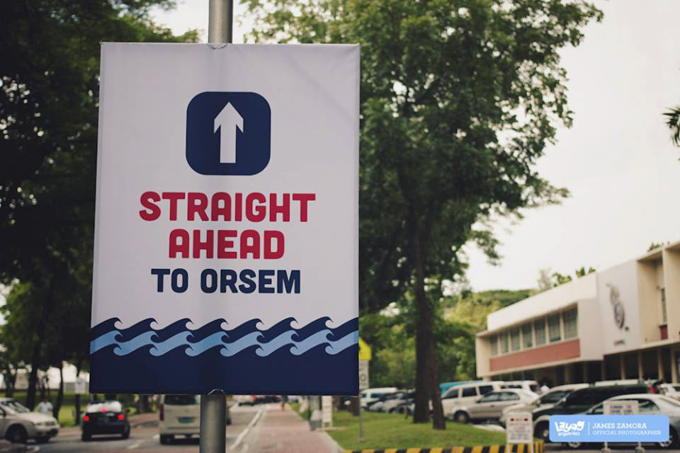
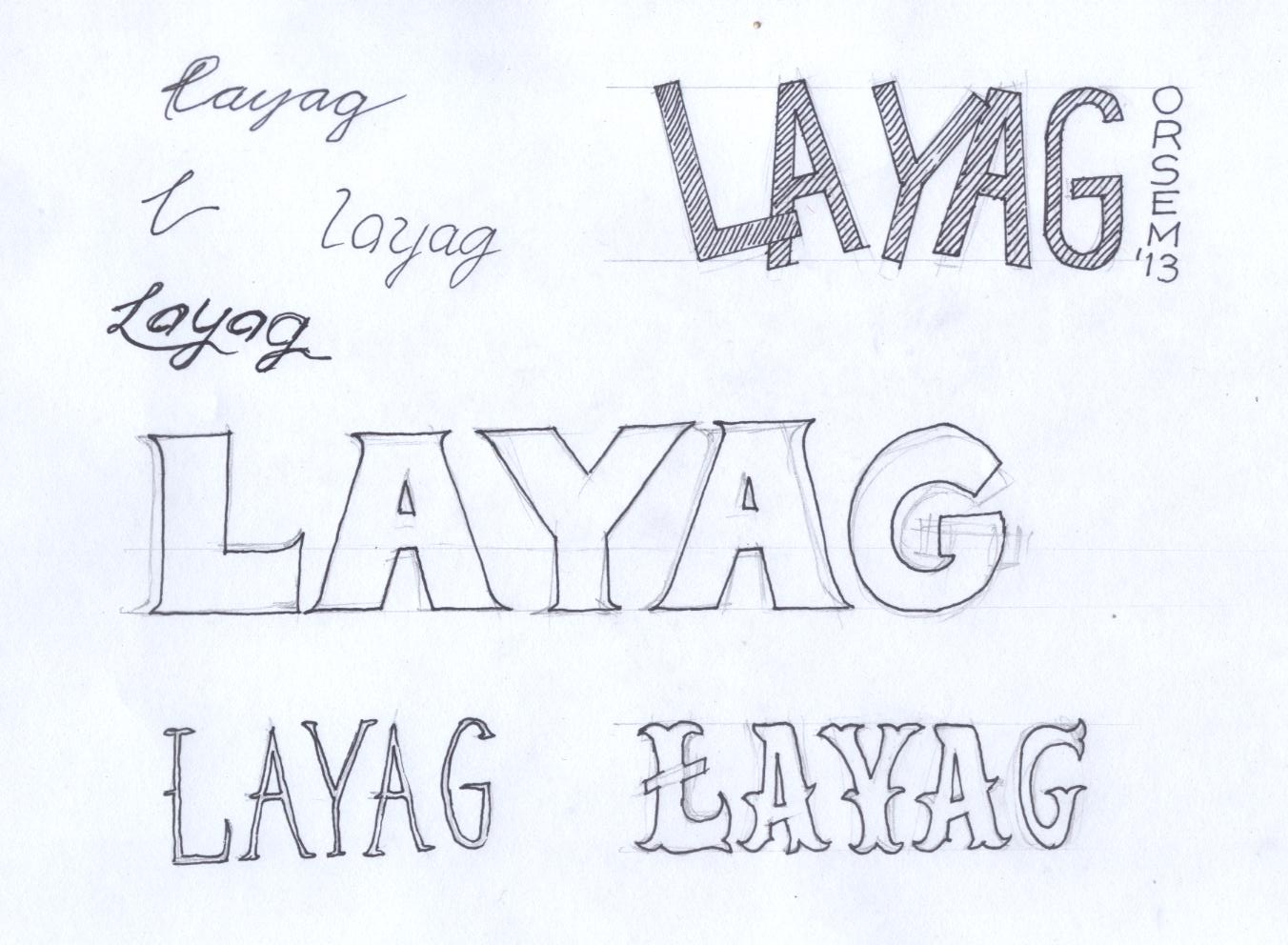
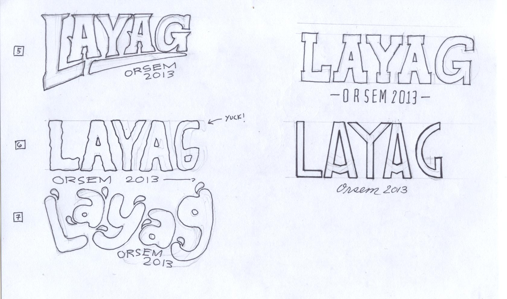
Logotype and Color Studies
Creating the logotype was also a strenous part of the branding. After trying to use fonts available online, I decided to create something from scratch that would jive more with the feel that I was trying to achieve. I also had to be flexible because the style that OrSem needed was something that I'm not really used to as a designer.
I started by looking at some references and trying to modify them on paper. Once I found the right logotype, I scanned my thumbnails and converted them digitally using Adobe Illustrator.

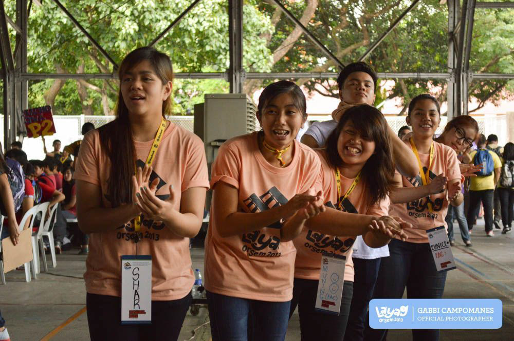
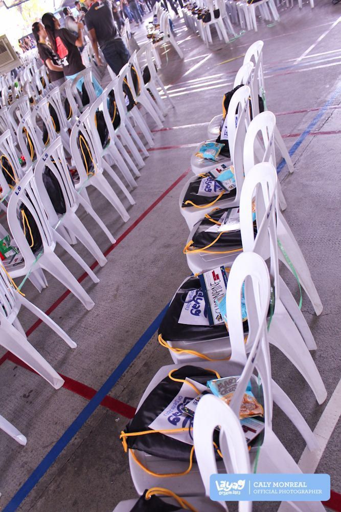
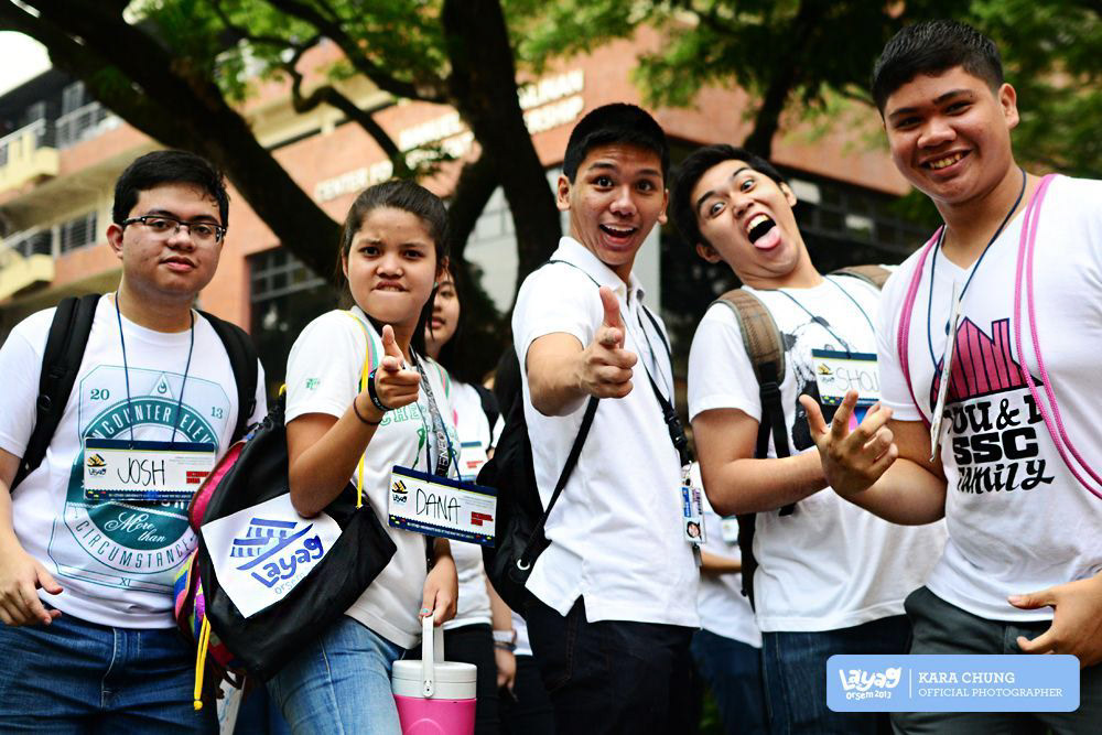
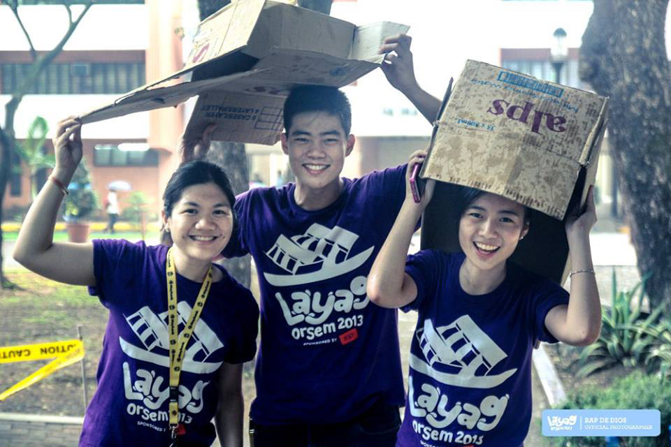
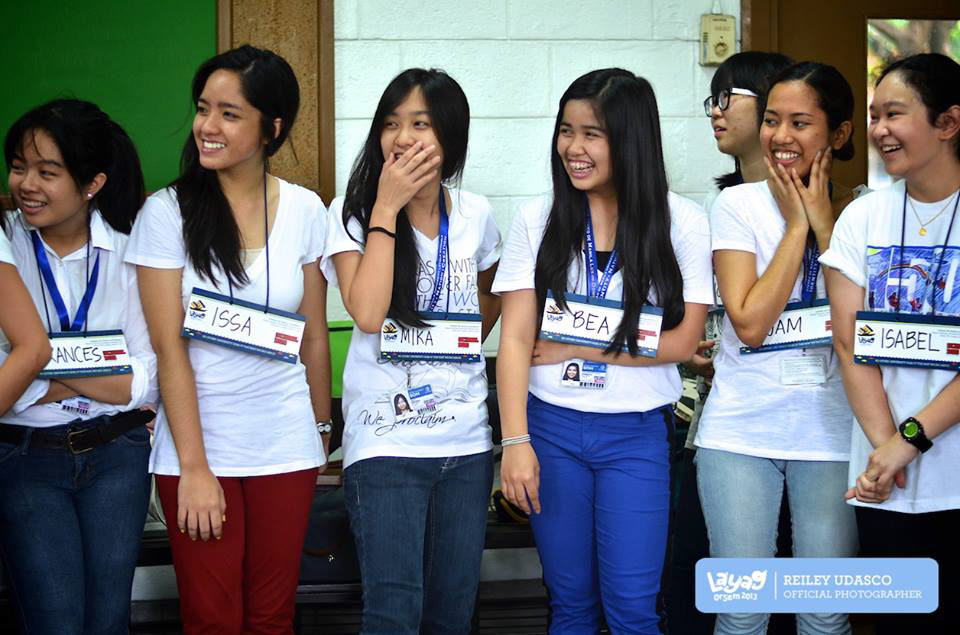
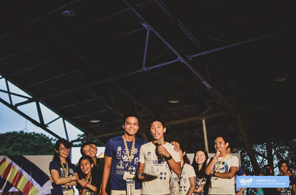
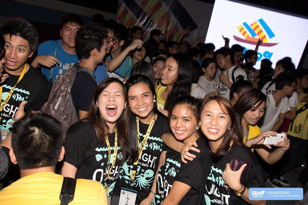
Photos during the event
For more details, check out the official OrSem website or the OrSem Facebook page.