Personal Typography Experiment
April 2013
I was really bored for the first few weeks of summer vacation so I tried to make something new while waiting for my internship to start.
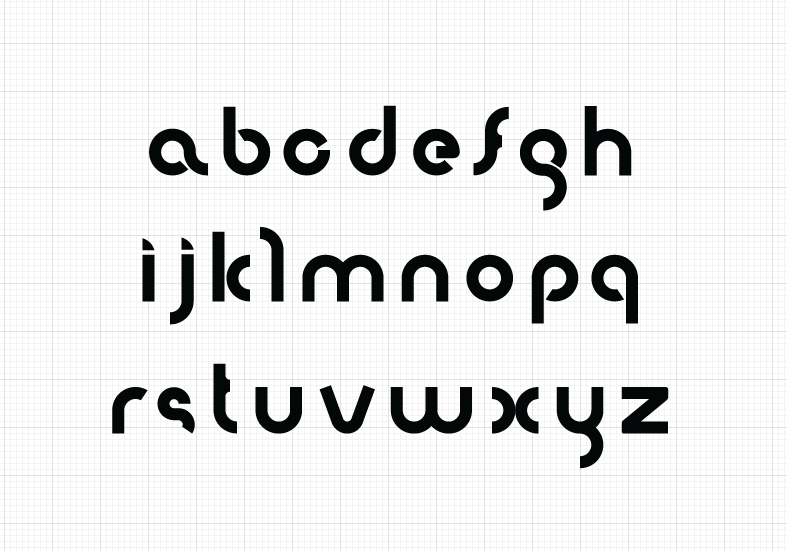
The design process took me a lot of time. I practically spent 5 hours creating all the lowercase letters, excluding numbers and symbols. Since I really needed to rest afterwards, I just stopped with the lowercase letters. It’s my first time after all.

I used Adobe Illustrator for the whole process because I really think I need more practice using Ai. Plus, it would’ve been a million times harder if I used Ps. I’ve used Photoshop for years now and I must say, everything gets easier once you use Illustrator, especially for vector graphics.
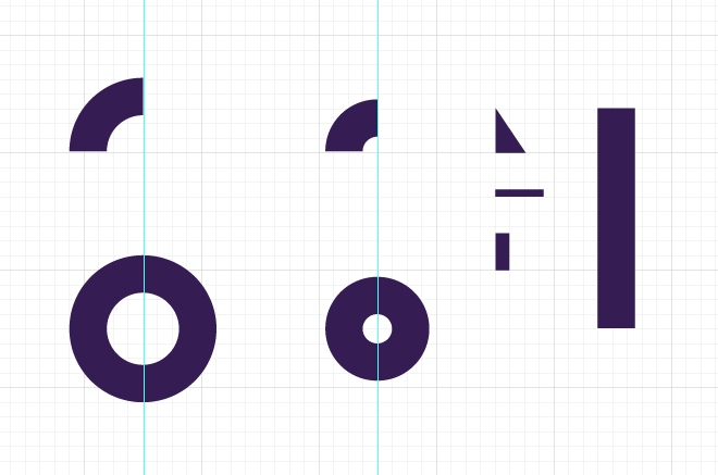
I used these circles, rectangles, and a triangle to maintain the width of the characters, as well as to maintain an x-height that would go consistently across the mean line throughout the different characters.
Below, you can see how I used both the rectangle and the triangle to make things consistent:
"a"
"b"
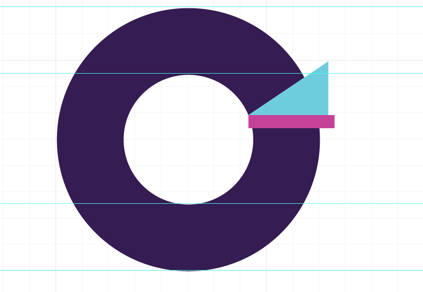
"c"
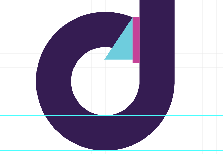
"d"
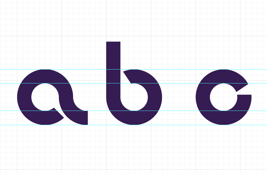
"a, b, c"
There were also some really exceptional cases when i had to defy the regular set of circles that I used:
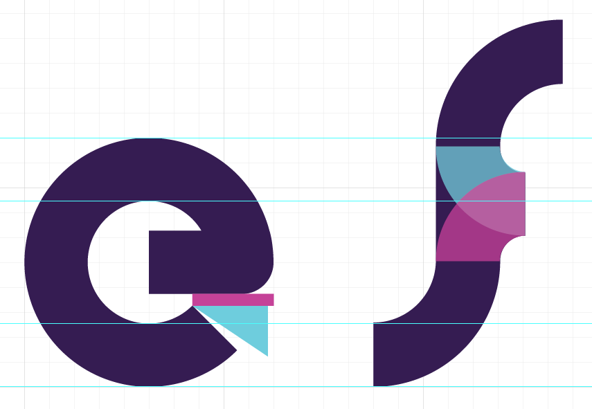
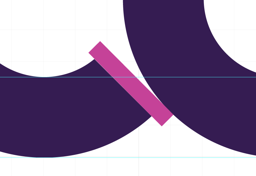
E AND F: The letter “e” took some time for me to make since using the regular set of circles meant that I would have to extend the height of the character, which I didn’t want cause it would be ugly beside the other characters. Instead, I drove a rectangle with the regular width and made small curves so that it won’t have a sharp end and be different from the rest of the characters. You might also notice that the letter “e” doesn’t follow the regular 33.33 degree angle of the triangle, cause I thought it looked weird, so I used a 45 degree angle instead.

"g"

"i"
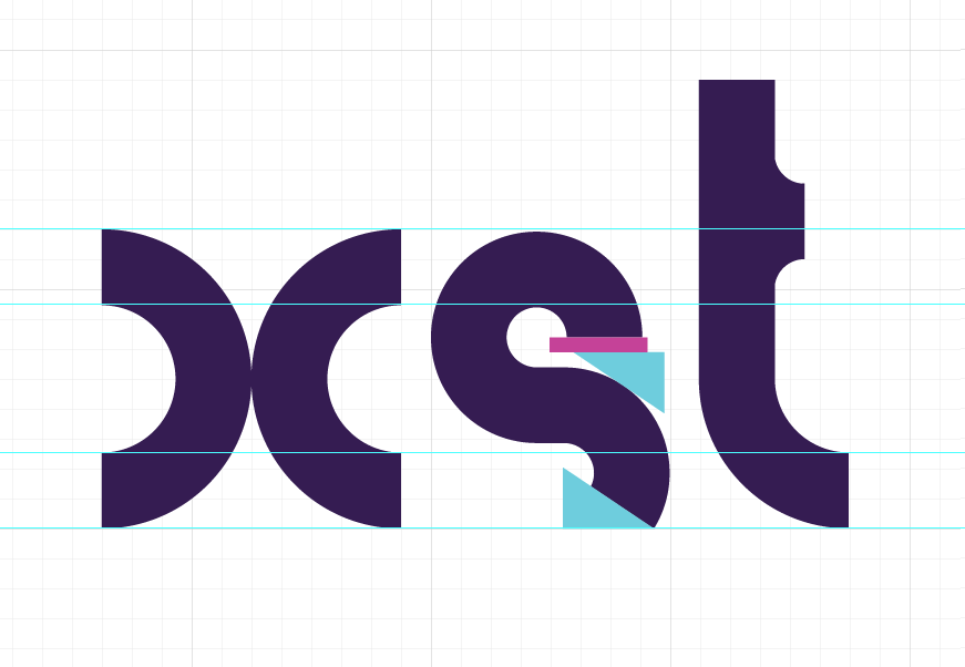
"x, s, t"
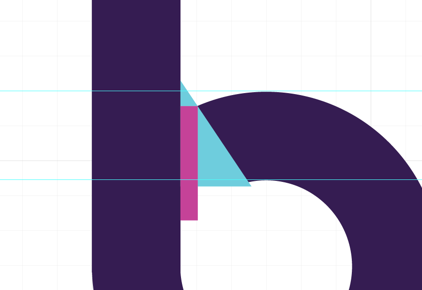
X, S, AND T: The letter s was also exceptional since it needed a mean line higher than the x-height, which I was totally against. To solve it, I decided to just use the triangle to cut the lower half at an angle.
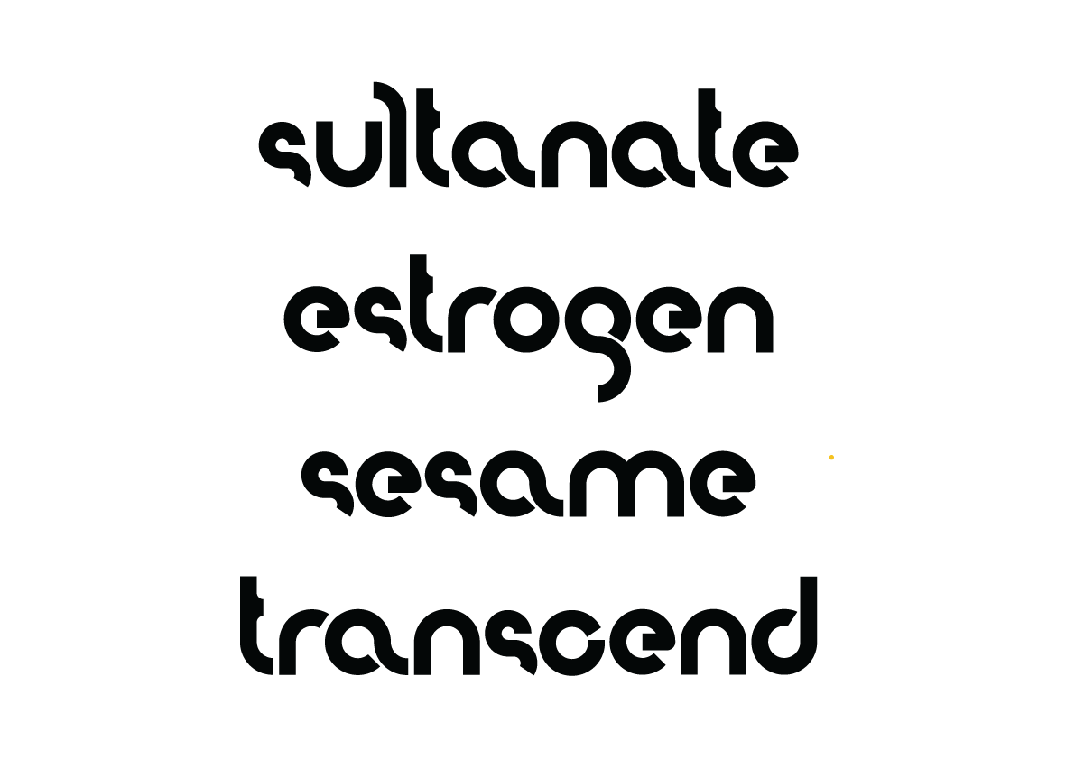
With the help of a few friends, I was able to test the readability of the characters and change some of its flaws. Here, you can see the first version where the letter “c” and “e” had little difference, which made them a bit unrecognizable for a few people.

And so, after hours of editing and consulting the opinion of my friends, I was able to come up with my first (incomplete) font.
Thanks to Jam, Merx, Cy, Miko, and Kirk for providing my test words. I also owe an equal amount of gratitude to Clev, Czari, and Meg for their kindness and patience in critiquing my work.
After this, I hope to either continue with the rest of the uppercase characters, or move on with my first script or serif typeface.
---
Disclaimer: I made this font from scratch without using any references or pegs. I basically started out with the two circles and played around with them. Any similarities to pre-existing typefaces on the internet are purely coincidental. It would totally be bad luck on my part if such coincidences do exist. :))
All text and images in this portfolio entry were originally posted in my Tumblr (re)blog last April. The font was formerly called "Hello Mixi".