A Lettering Project
by Jan-Daniel Belmonte, Rachelle Bantayan, and Caroline Carmona
October 2013
For our final project in FA 165.1 (Introduction to Visual Arts), we were asked to create any form of design that could represent the report that we previously presented in class. Our group reported about Meggs' "National Visions within a Global Dialogue".
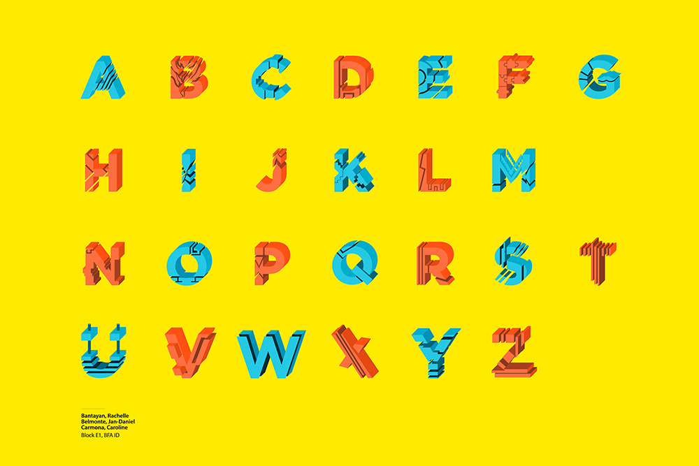
We tried to make our version of Takenobu Igarashi's poster for Expo '85 and Poster Calendar. What we did was to take Igarashi's style of turning 2D typography into mechanical 3D forms. We also tried to use fun, bright colors and a clean background that emphasizes the complexity of the type.
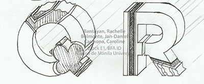
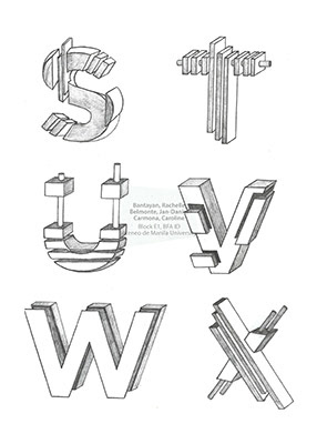
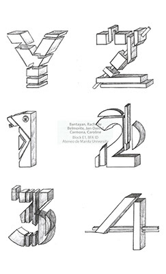
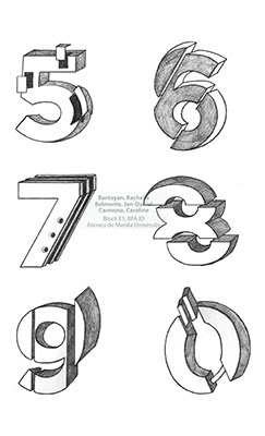
For our design process, we opted to use Gotham Black as our base font because it is a very solid font that is easy to modify. We also chose it because it is very much apt for the topic of Globalization. I started by sending templates to my groupmates that they would modify through manual drawing and scan afterwards. This was done so that the sizes of the scanned images would be uniform and easily manipulated in Photoshop.
We tried to make our version of Takenobu Igarashi's poster for Expo '85 and Poster Calendar. What we did was to take Igarashi's style of turning 2D typography into mechanical 3D forms. We also tried to use fun, bright colors and a clean background that emphasizes the complexity of the type.
For our design process, we opted to use Gotham Black as our base font because it is a very solid font that is easy to modify. We also chose it because it is very much apt for the topic of Globalization. I started by sending templates to my groupmates that they would modify through manual drawing and scan afterwards. This was done so that the sizes of the scanned images would be uniform and easily manipulated in Photoshop.
After Caroline and Rachelle sent their edited characters to me, I vectored them in Photoshop and used different shades of red as default colors. After vectoring all of the letters, I then decided on a color scheme and used it for the final product.
Our work was finally printed on a 20"x30" sintra board and displayed at the Fine Arts Exhibit Hall at the Ateneo de Manila University.
Posted below are the images of the design process in order of creation.
Posted below are the images of the design process in order of creation.
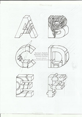
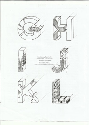
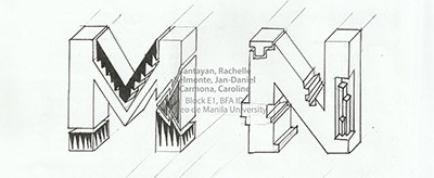
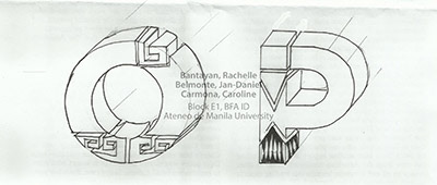
Note: The original hand-drawn characters were not followed exactly because of time constraint. I had only about 10 hours to vector this because we were trying to beat the deadline in order to avoid a grade deduction.


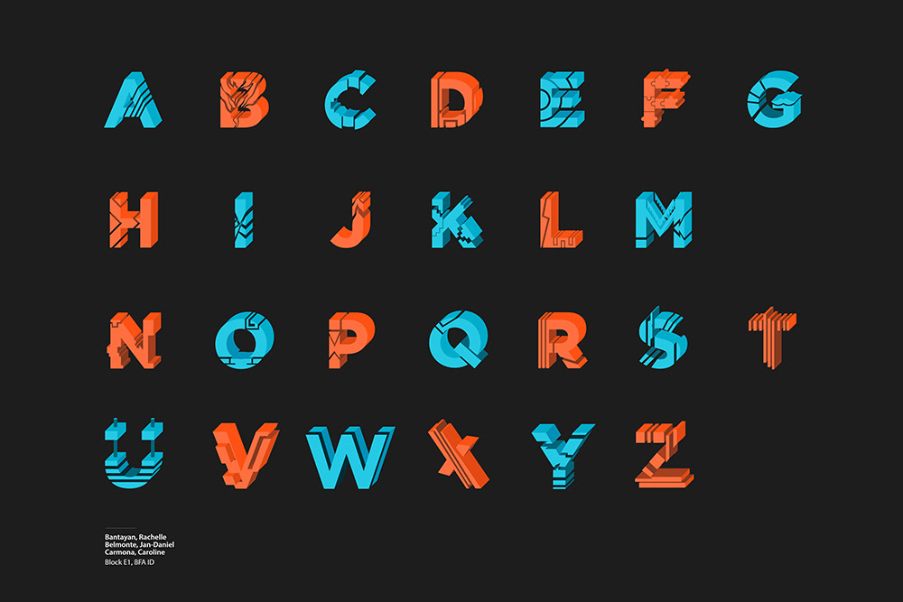

The hardest part was choosing between centered and left-aligned text. We decided to use left-aligned because it replicates the organization that can be seen in Igarashi's works. We also had to decide whether we would use the layout with the black background or the yellow background, but we chose black because of its potential to emphasize the intricacy of the characters and their bright colors.
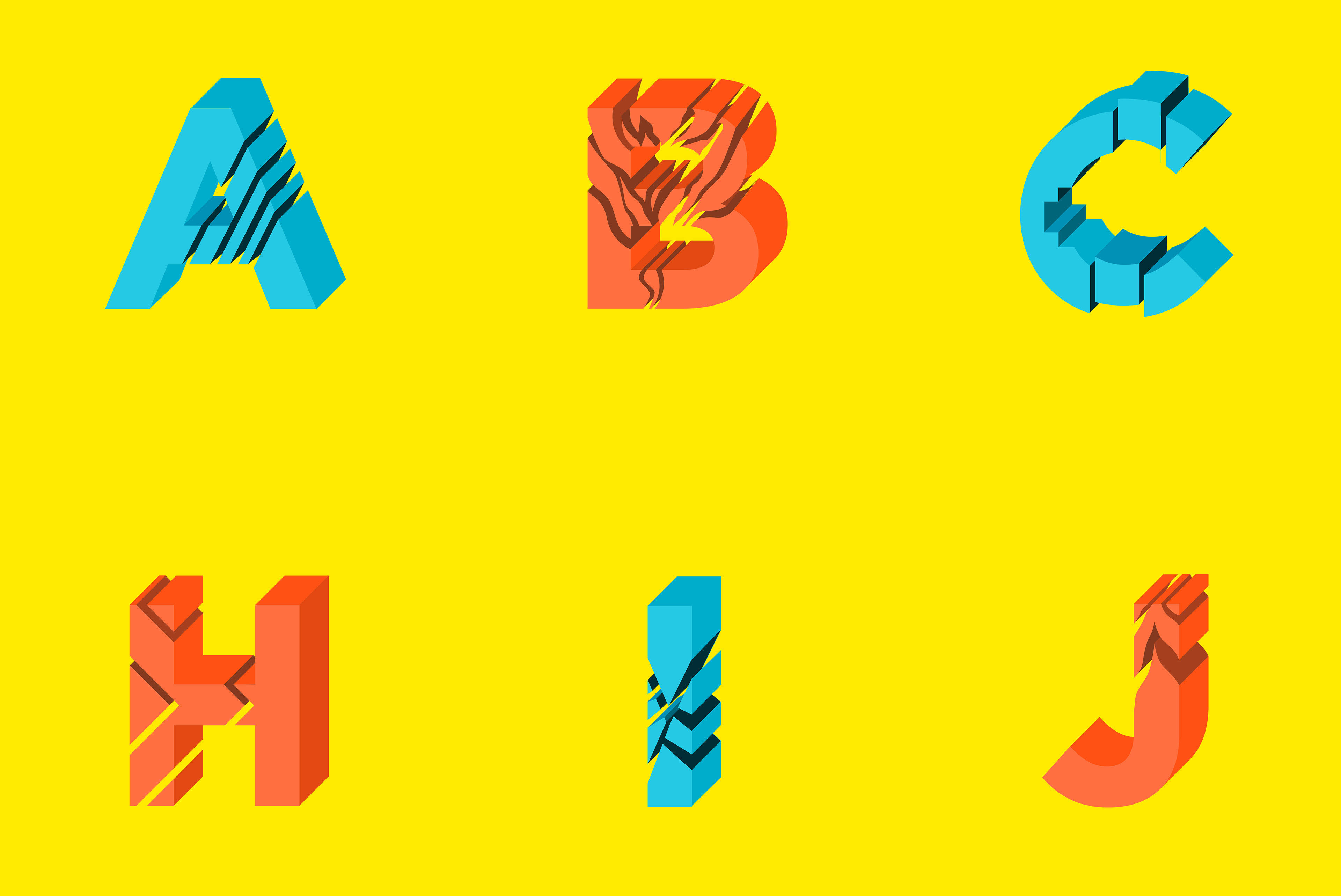
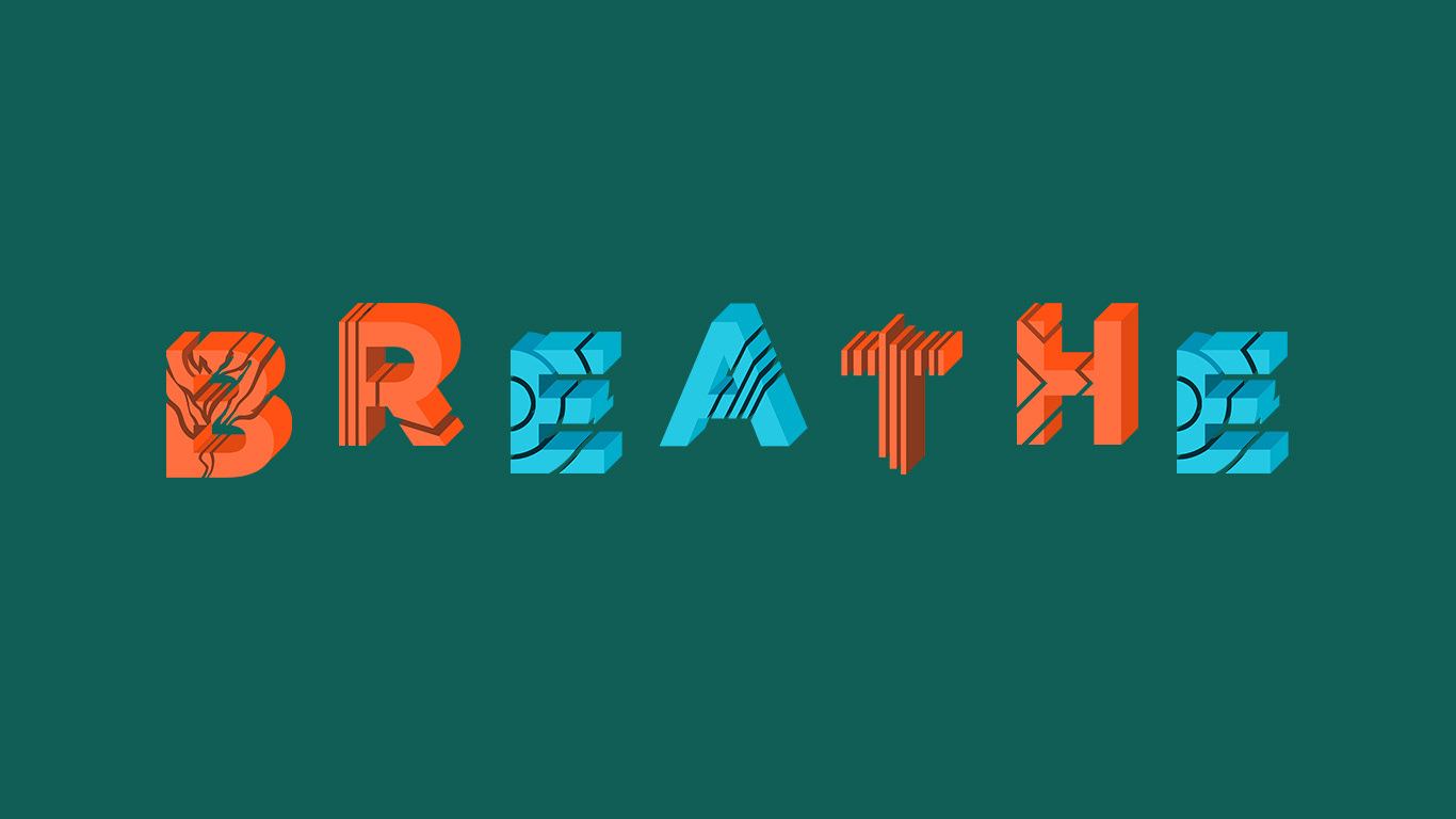
I also saved the letters individually as PNG files so that I can use them for other purposes such as this wallpaper:
If I have time in the future, I will to try my best to follow the exact sketches of the designs and probably even develop the characters into an OTF or TTF font. In the meantime, my groupmates and I are glad that we were able to pull this off with such limited time and actually score a 10/10 for our final project.